A deep dive into the transformation of this six-bed home with architect Barnaby Gunning and interior designer Sarah Delaney.
This month, we’re celebrating the spirit of growth at Domus Nova. We’ve welcomed new clients to the Domus Nova network and said see you soon as we helped keys swap hands and houses become homes. These successes are a testament to the expertise brought by our team and the standard set by our handpicked portfolio of design-led properties. And as we pass the halfway point of 2021, things are still looking bright.
Feeling reflective, we wanted to take a moment to spotlight what makes our homes special – the considerate architectural touch, the modern design sensibility, the exclusive postcodes. And who better to explore the value added by good design than architect Barnaby Gunning and interior designer Sarah Delaney, the duo behind recently sold Leamington Road Villas?
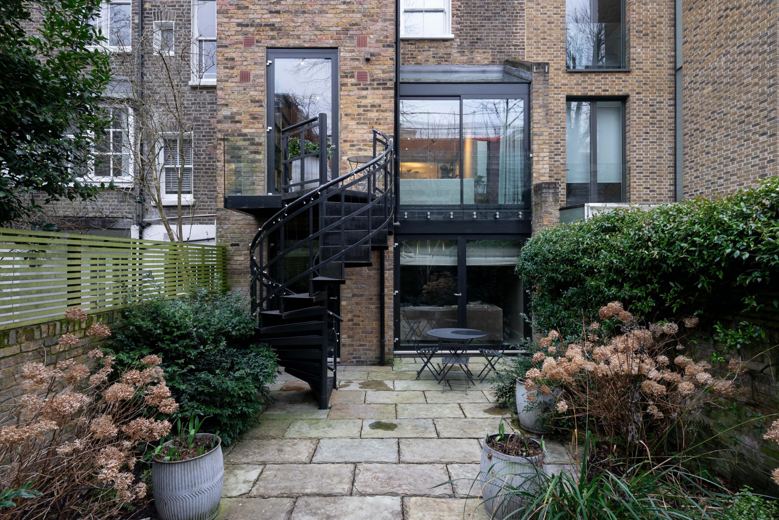
Teaming up to first reconfigure their client’s country house before turning their focus to this six-bedroom London townhouse, Barnaby and Sarah took what was already an architecturally uplifting space and elevated it to meet the evolving needs of their client. In between planning and site visits, the creative force behind Leamington Road Villas’ enhanced blueprint spoke to us about their collaborative approach, their clever solutions and the features they are most proud of.
What was your objective?
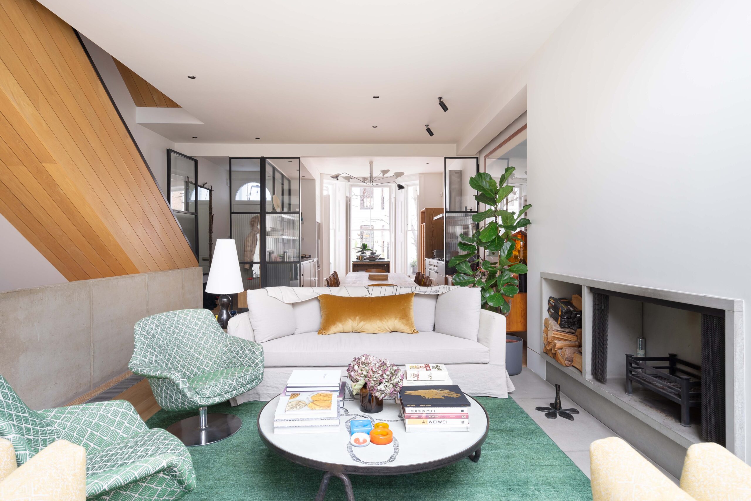
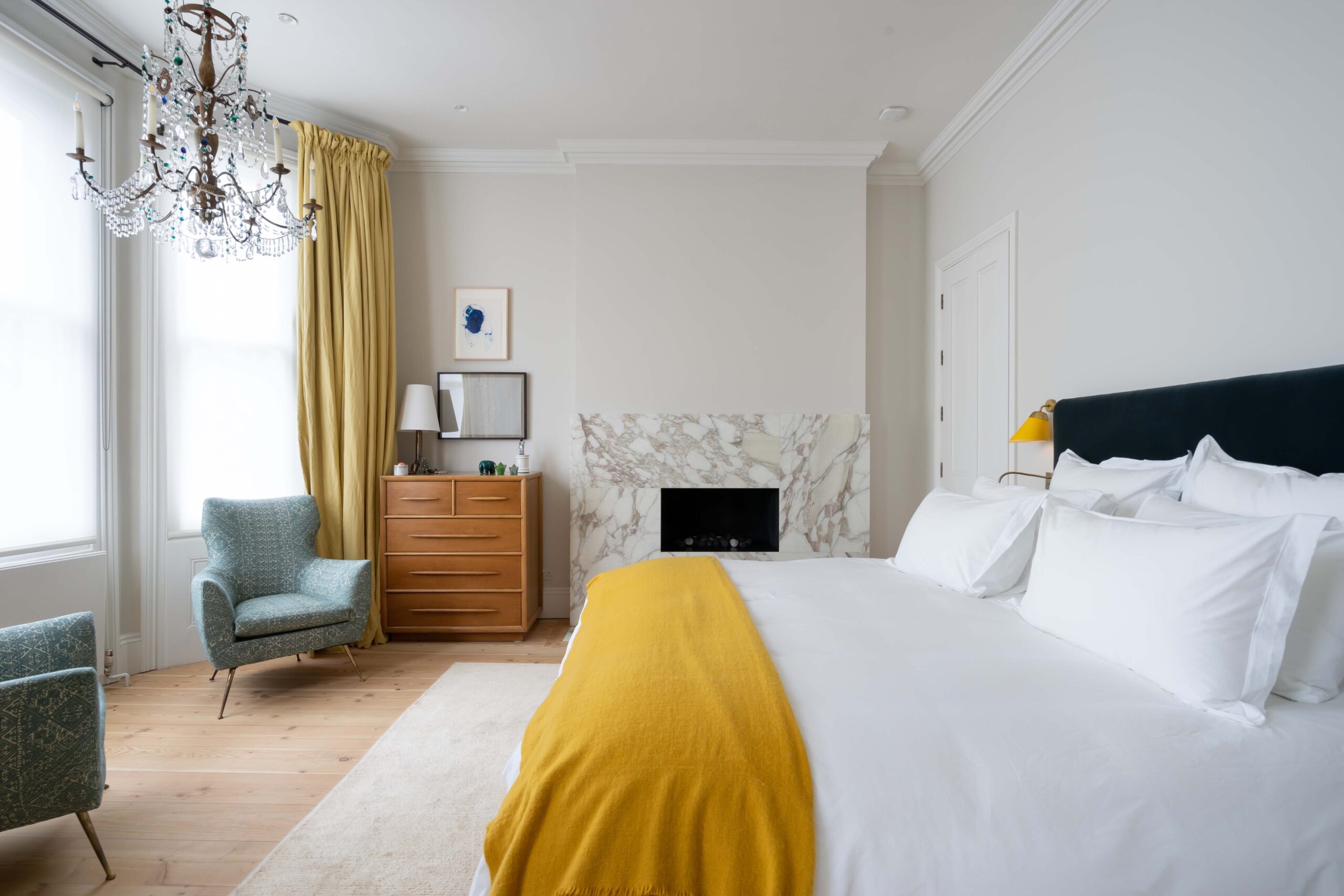
Barnaby Gunning (BG): Primarily, we focused on creating a sense of coherence in the house. Sarah and I had noticed that there were a lot of different timber surfaces and things going on and what was a big statement in the architecture was actually in need of editing to accentuate the best aspects.
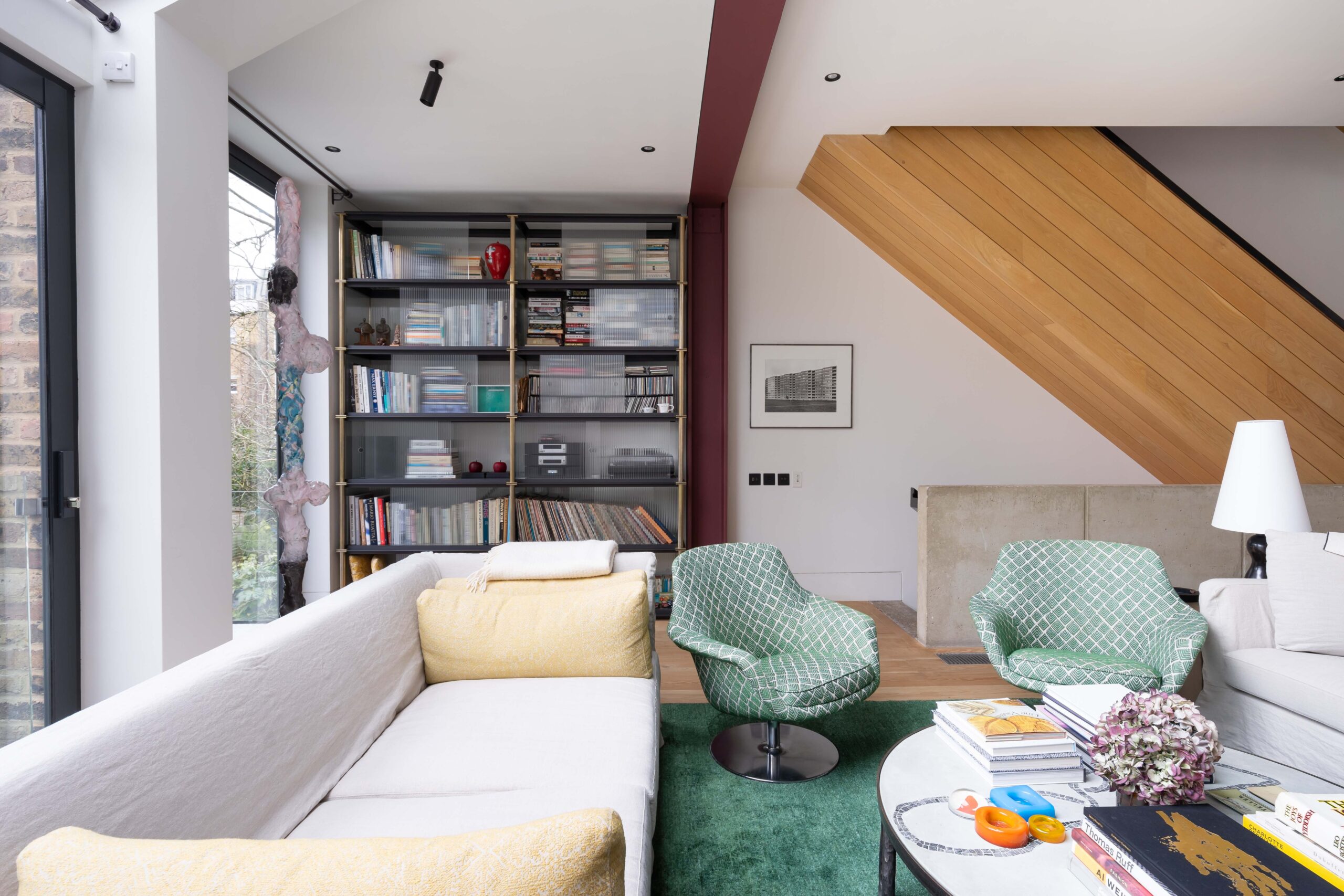
Sarah Gunning (SG): We pared back the palette using light paint colours and rich fabrics, adding more low-level lighting to create a modern yet classic backdrop for their busy lives. This calm elegance is punctuated with some bright and eclectic fabrics that complement the owners’ collection of artworks and artefacts.
How did you approach the project?
SD: The house had been previously refurbished and given great bones. We highlighted these bones with dark accents to give a bolder structure to the interiors – the handrail to the existing stair was ebonised and black fittings were added to light the art.
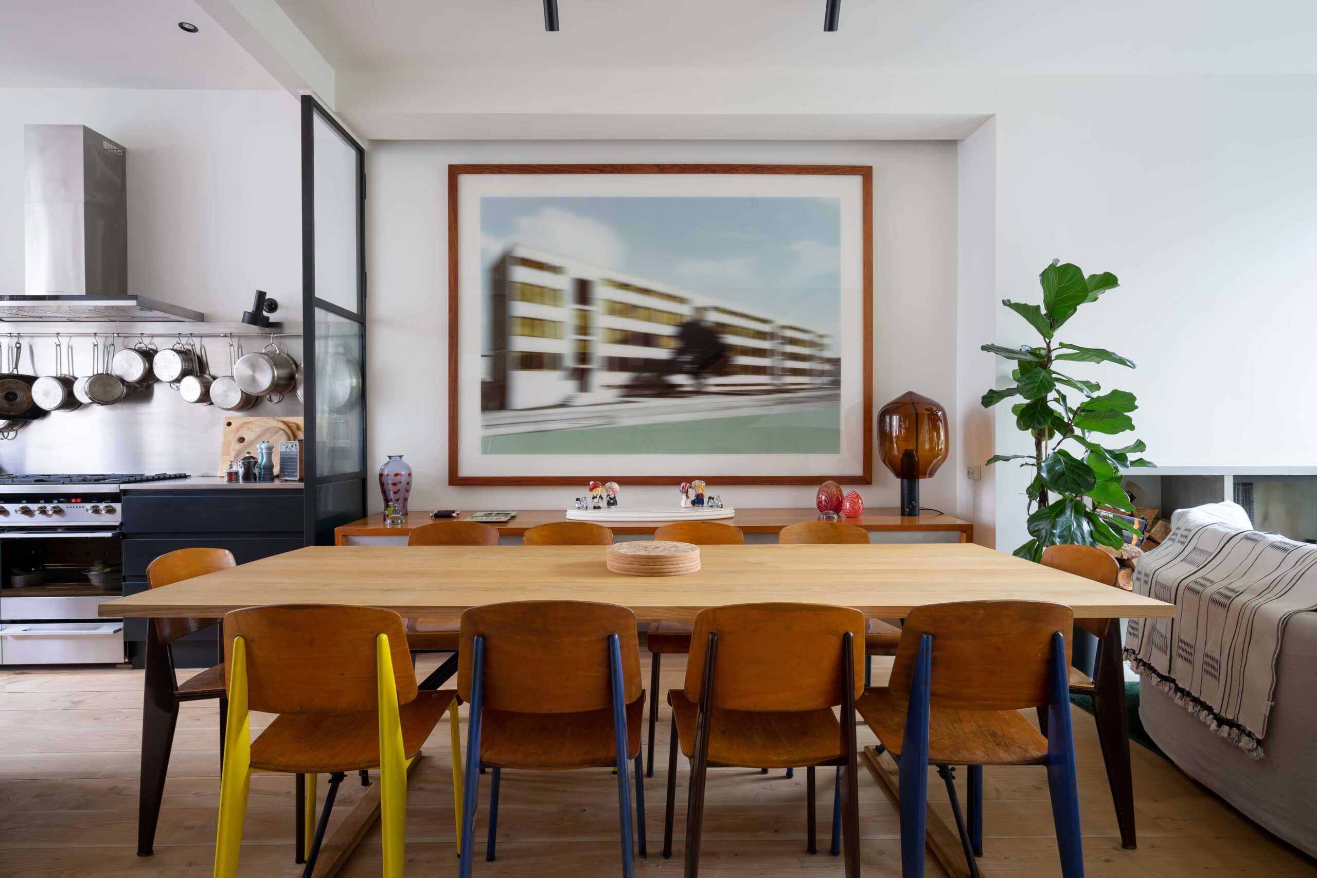
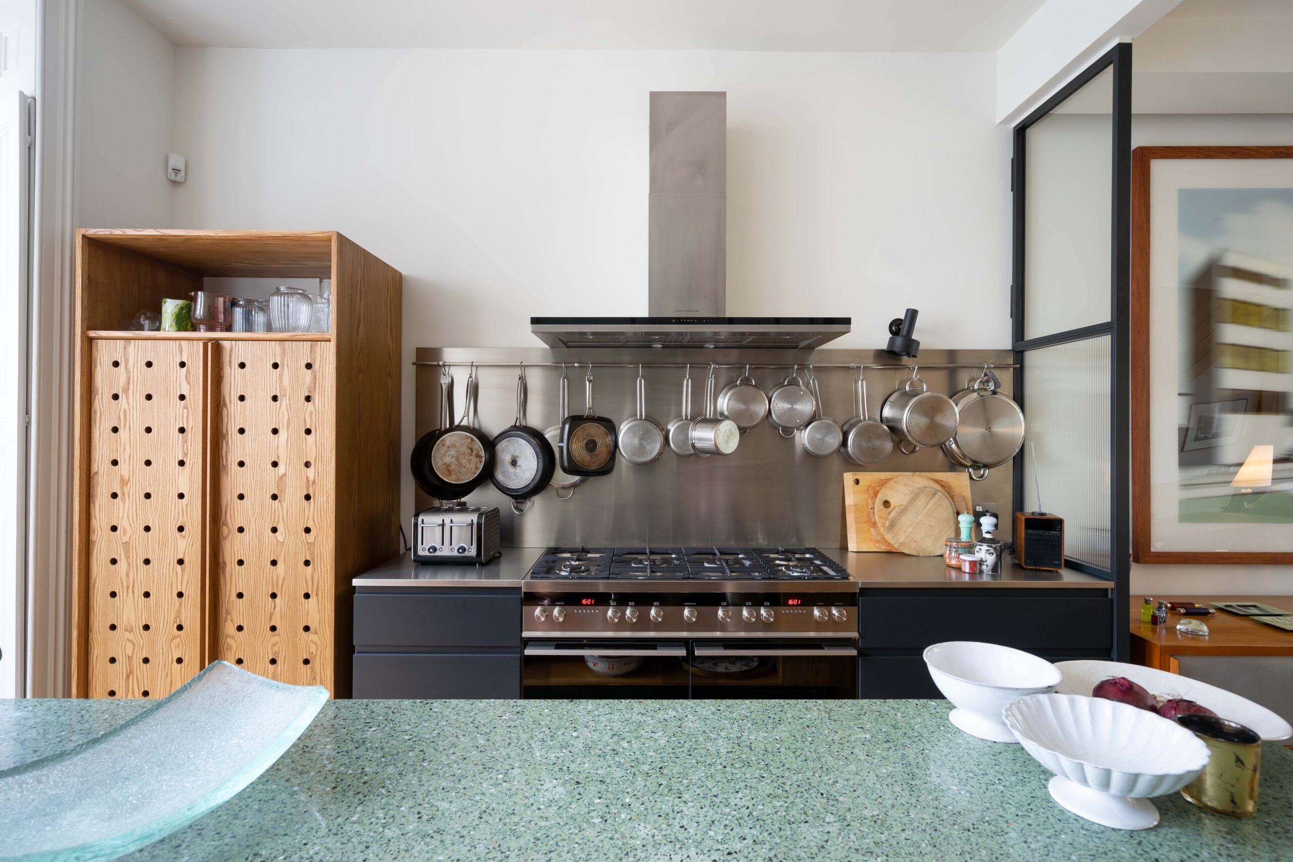
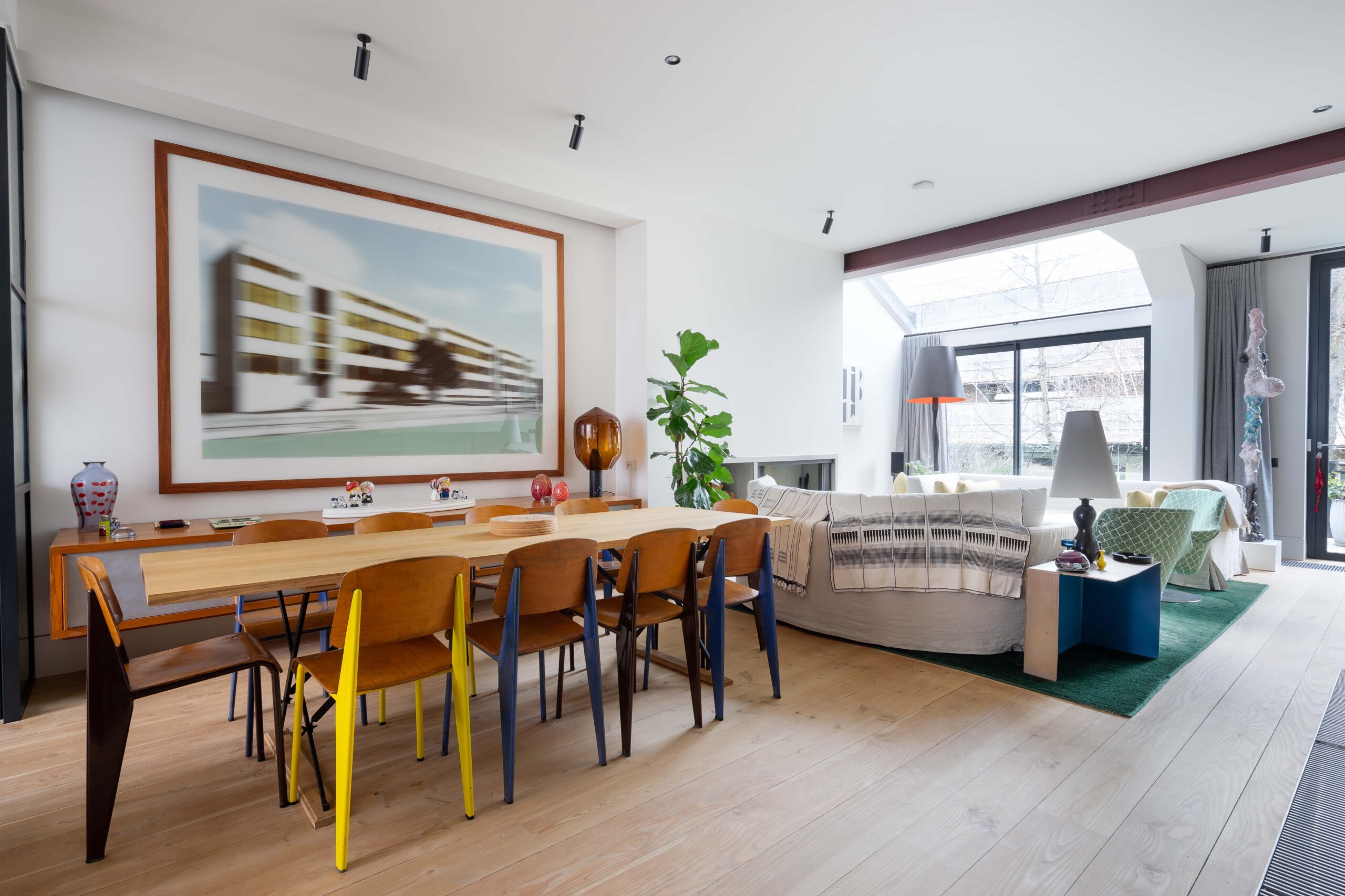
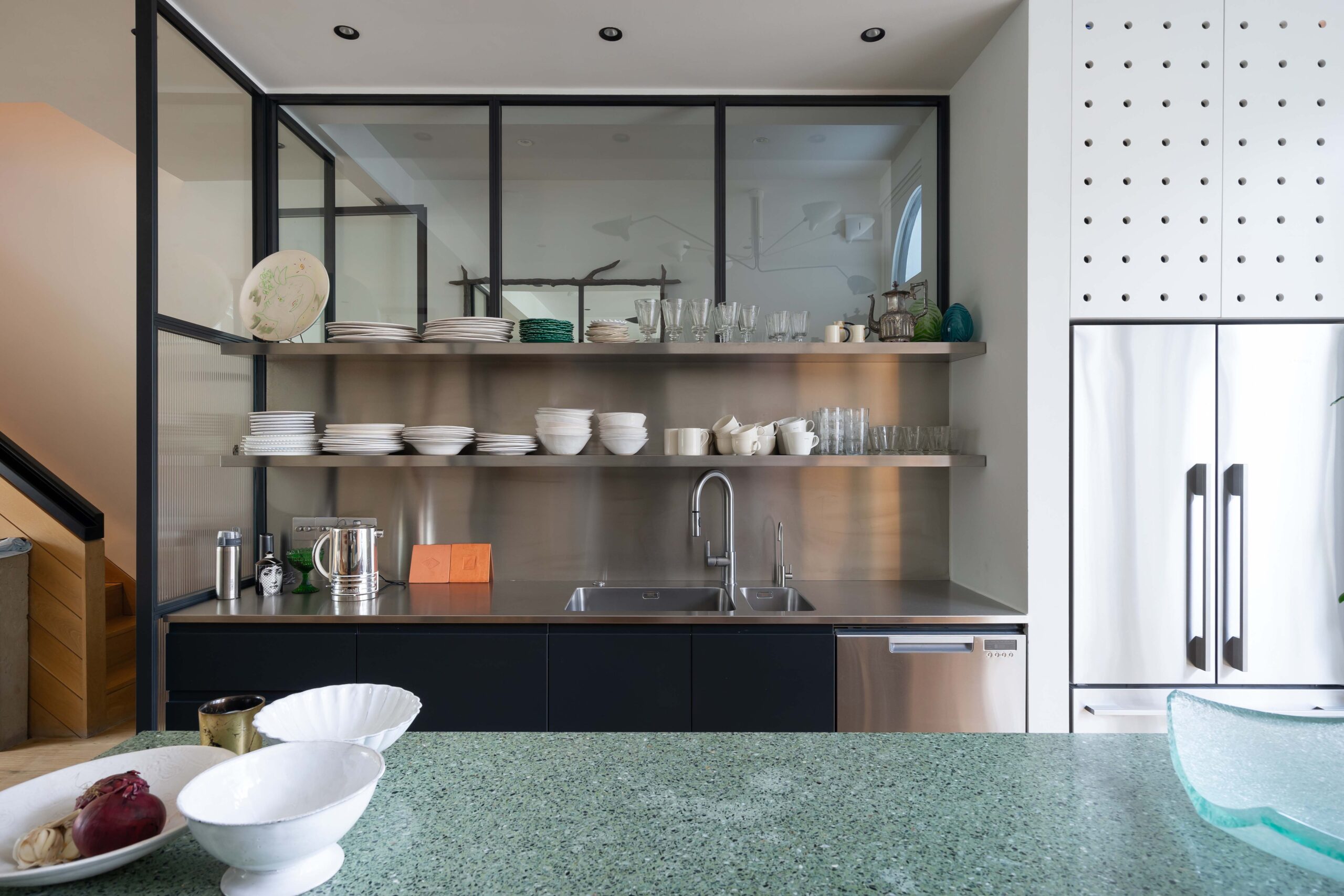
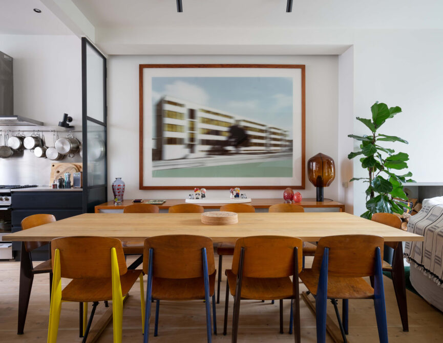
BG: For me, the core of the project started with the works to the main upper ground floor area. There was a very striking concrete kitchen that picked up on the in situ concrete frames around the stairs to the lower floor but because of this, the kitchen felt quite heavy and narrow.
Our client wanted a way to subtly screen off the kitchen from the dining area to visually close things off. At the same time, we wanted to try and make the ground floor feel airy, open and coherent.
SD: To do that, we added new dark metal internal Crittal screens to define the hall/ kitchen/ dining area but the slim profile and glazing give a real sense of openness. The screens echo the divides in modern restaurants where the cooking process is partly on show to the diners.
BG: And by tweaking the plan and moving away from the concrete feel, we could build a little more width in, which meant we could create a kitchen island and add more storage and surfaces space while the whole floor felt bigger. It was a Tardis effect.
Sarah made a great suggestion early on, too. She wanted a larder-style fridge-freezer and designed a complimentary dry larder, too. It reduces the bulk of the kitchen and let us move away from the built-in-kitchen-units look. This helped to open up that side of the ground floor and to make it more coherent.
What inspired you?
All of our projects are a collaboration with our clients. You learn a lot about who the client is through the design process and how they live in their properties. As you learn this, it influences how you design it and seeing what works for them, which inevitably spins off into helping guide the design of things. I was particularly inspired by the client’s lovely Charlotte Perriand sideboards. We wanted to just subtly draw on that as a way of leading the design of the joinery, including in the dry fit unit in the kitchen and cabinetry elsewhere in the property.
You mentioned coherence. It seems stripping it back and creating harmony and balance was central to your aim. How else did you achieve this?
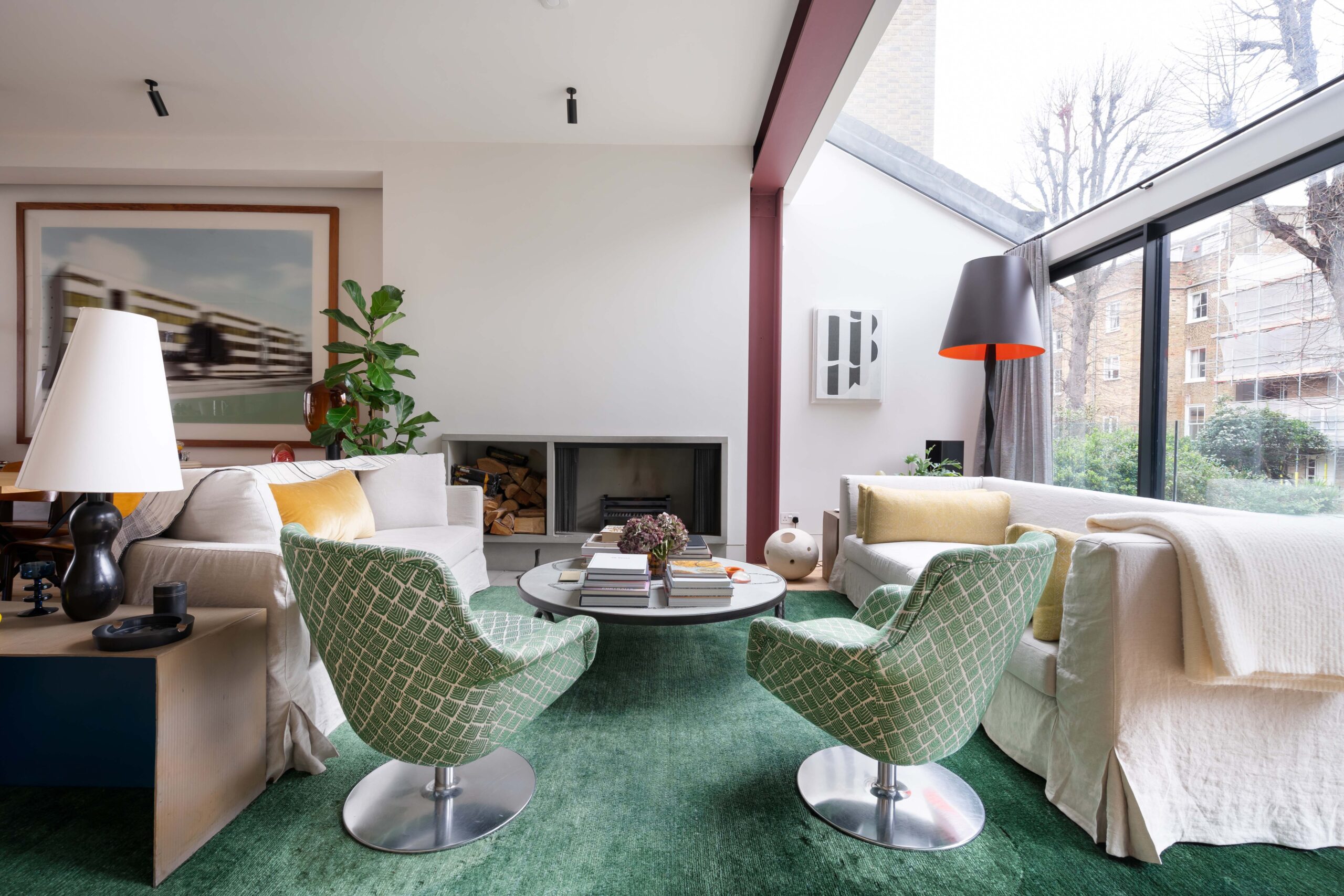
We wanted to get to the essence of what feels right about the place – the greenery on both sides of the house, the light coming through – and tying those qualities together. On the ground floor for instance, along with the Charlotte Perriand sideboard, the clients have interesting art pieces. One of them in the living room had this pale green-grey colour in it, which reflects some of the trees and greenery at the back of the house. We thought it would be nice to draw the greenery through the property. We spent a lot of time looking around at different materials and we came across this beautiful terrazzo that had a similar grey-green colour to it. It complemented the two different timber floors in the kitchen and living room area, too.

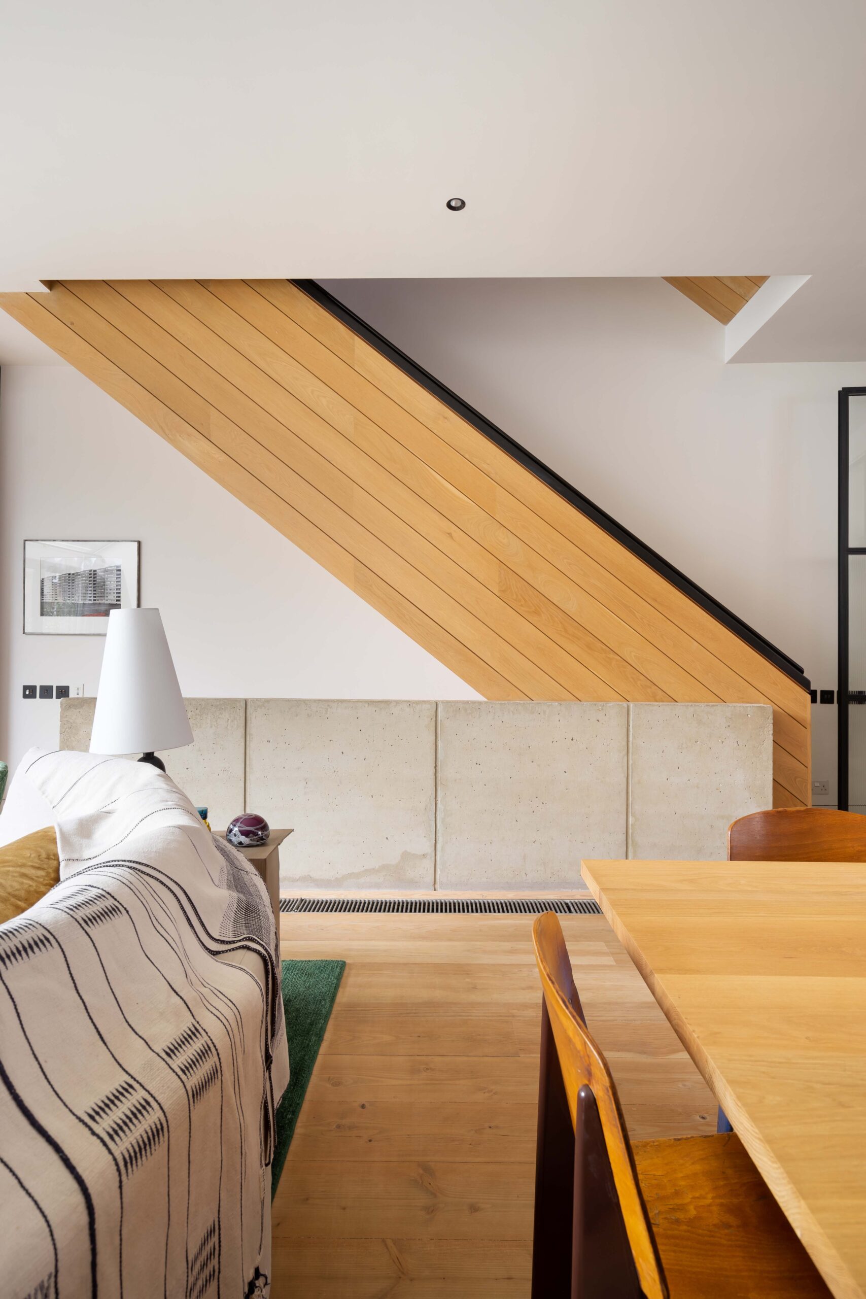
The main staircase was a really striking part of the original design. We didn’t change the structure of the staircase at all, we just tweaked it to simplify it. The stairs that led down to the lower-ground floor was made of concrete, but the ascending staircase was timber with varnished surfaces and a glossy cherry wood handrail. The combination of that detracted from the beauty of the denizen flooring on the ground floor, so we knocked back the surfaces to reduce the glossiness of the timber. Sarah and I thought that there’s something very tactile about black piano lacquer and we could use that as a way of coating the handrail to make it relate better to the partitioning system and the other details elsewhere and it was pleasant to touch, too. It makes it all come together much better than it had done previously.
What part of the design are you most happy with?
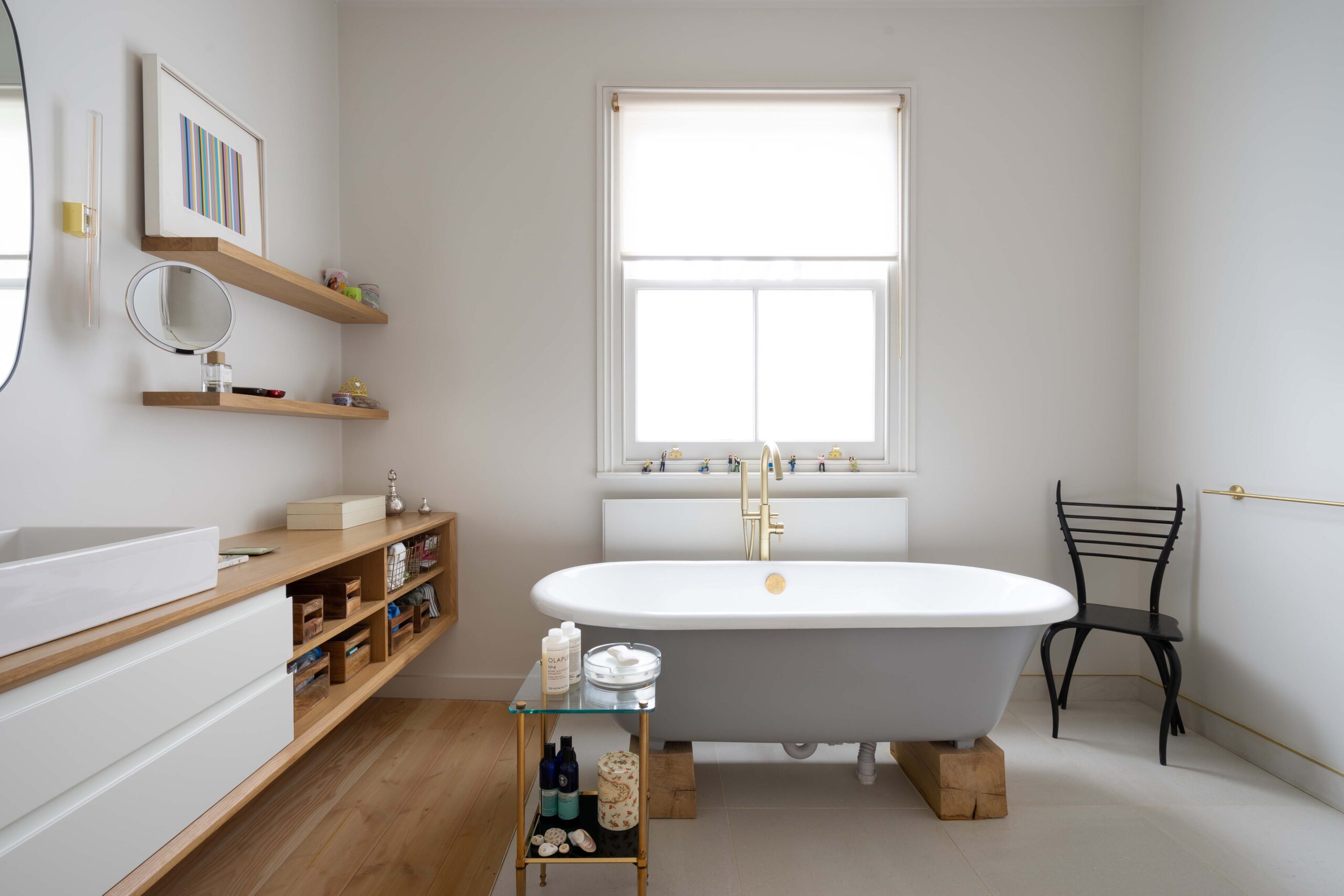
We made quite a few changes to the master bathroom and I’m quite pleased with the way that it came out actually. We made it feel bigger and airier while adding extra features. Previously, it had a built-in bath but no shower. We wanted to tweak the bath to make it feel grander and to get a shower in. By replanning elements of the room, we were able to create a larger surface area. Sarah had an idea to use a curtain for the shower area – a clever solution because it avoided the glass box syndrome, but it had quite a minimalist quality, too.
Related articles
Leamington Road Villas W11
A six-bedroom home reconfigured by architect Barnaby Gunning and interior designer Sarah Delaney. Clean lines and a refined palette.
Apt: A New Chapter of City Living
Design virtuoso Stephane Piazza of Apt Architects on his transformation of Chapter House in the heart of Covent Garden.